A huge thank-you to everyone who celebrated the launch of Torch last week with me, from the bloggers who posted guest essays and interviews to the people who spread the word on Twitter and Facebook. I also received some great questions and comments, one of which inspired this post:
Why is the audiobook cover of Torch different from the one for the print and e-book?
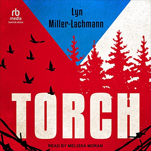
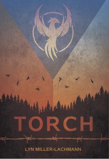
The person asking the question liked the audiobook cover, produced by Tantor Media. It features the primary colors of the then-Czechoslovak, now-Czech flag — blue, red, and white — along with barbed wire, trees, and birds flying above. But the color scheme is simpler and there’s a different typeface for the title and author.
So here’s my answer:
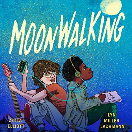
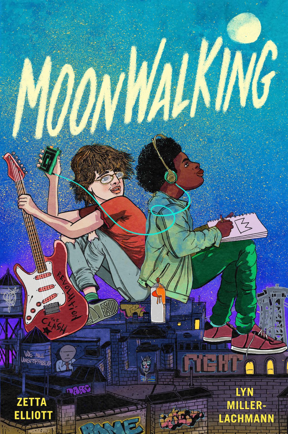
The reasons are twofold. The first is that the audiobook dimensions are different, so a tightly designed cover, one that utilizes the entire vertical space, won’t fit inside a square. Contrast the original Torch cover to that of Moonwalking, where most of the artwork is in the center, so that the top and bottom can be trimmed more easily. Even so, Moonwalking‘s audiobook from Findaway cuts off part of the moon on the top and the graffiti-covered buildings of Williamsburg, Brooklyn on the bottom.
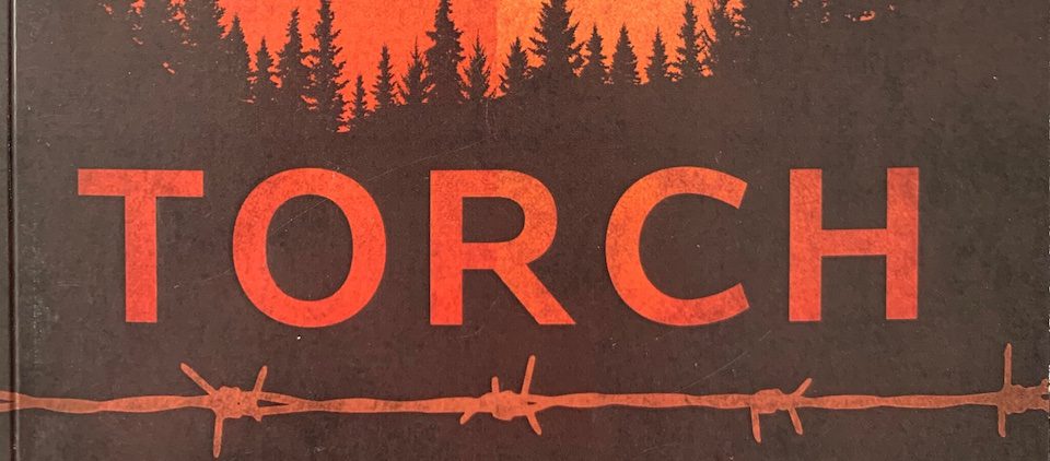
 The second reason has to do with the nature of digital only images. A print book can be held, seen from various angles and distances, and turned over to view the back. Now that most audiobooks are not sold in boxes like traditional CDs or DVDs of old (although those boxes are the reason for the square cover dimensions), the single front cover image is the only one prospective listeners see. And it has to work in multiple sizes, including thumbnails. The simpler the better, as long is it’s not so simple to be generic or boring. The cover of Torch‘s physical book works on multiple levels. That’s why I love it so much. The muted blue, red, and white of the background gives the image a three-dimensional quality, but it’s also the color and design of the flag. And the barbed wire on the front does not appear on the back cover, as if it’s “the freedom side.” The birds fly above it all, unfettered by human boundaries. I feel that the designer from Tantor Media did a good job of conveying the novel’s themes while simplifying the image for online viewing.
 I look forward to hearing the audiobook, narrated by DJ and veteran narrator Melissa Moran. I was in touch with her several times during the process to discuss the pronunciation of given names, place names, and words in Czech and several other languages.
In the meantime, Torch has another review, and it’s an Editor’s Choice from the Historical Novel Review. As a regular reader of HNR (and sometime reviewer), I know that those Editor’s Choice designations are rare, the equivalent of a star from the toughest trade journals. The reviewer wrote:
I cannot praise this book highly enough. … Like all the best historical fiction, without sacrificing period perspectives, we are forced to look to our own souls.
And just in time for the launch, Publishers Weekly included its starred review of Torch as one of the Reviews of the Week last week.


Congratulations on your stellar reviews, Lyn! I didn’t know the reasoning behind the cover choices, so thank you for that explanation.
It was a crash course for me, because I was surprised to see the cover of Torch so changed. But redesigns for new formats do take place from time to time, as do cover changes for paperback editions. Different reasons, though.
Pingback: Audiobook News! | Lyn Miller-Lachmann